
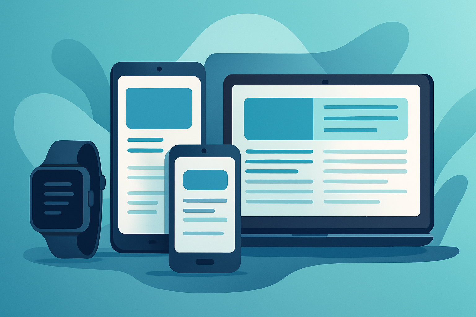
The mobile ecosystem is vast, diverse, and constantly evolving. With a multitude of devices flooding the market—from compact smartphones to large tablets—users expect seamless experiences regardless of the device they’re using. One of the biggest challenges mobile app developers face is ensuring their applications work efficiently and look consistent across all screen sizes and resolutions.
This blog explores the importance of optimizing mobile apps for different devices and provides a practical guide on how to achieve that with precision and care.
Why Device Optimization Matters
A mobile app is more than just a piece of software. It is the face of your brand, a direct channel to your users, and a critical touchpoint in your digital presence. Poor optimization can lead to:
- Broken layouts
- Poor readability
- Unresponsive design
- Negative user reviews
- Uninstalls and low retention
By contrast, a well-optimized app ensures better user engagement, increased usability, and higher chances of conversion and retention.
The Challenge of Fragmentation
Device fragmentation refers to the wide variety of devices, operating systems, screen sizes, resolutions, and aspect ratios. Android, in particular, presents a significant fragmentation challenge due to the large number of manufacturers and models. Apple devices also come in various sizes with different screen characteristics.
This diversity makes it essential for developers to design flexible and adaptable apps that respond well to the device environment they are rendered on.
Key Principles for Screen Size Optimization
To successfully design an app that works well across devices, it’s vital to follow these core principles:
1. Responsive DesignResponsive design ensures that your app adjusts gracefully to different screen sizes and orientations. Rather than designing for a fixed width or height, the layout should be fluid and adaptive.
Tips:- Use flexible grids and containers
- Rely on percentage-based dimensions instead of fixed pixel values
- Allow images and components to resize proportionally
While responsive design adjusts elements dynamically, adaptive layouts involve designing distinct layouts for different screen categories. This approach allows you to tailor the user experience specifically for phones, tablets, and foldable devices.
Android Example:Use resource qualifiers like layout-sw600dp for tablets or layout-small for compact screens.
iOS Example:Utilize size classes (Compact, Regular) and Auto Layout in Xcode to define rules based on screen width and height.
3. Scalable UI ElementsText, buttons, and other interactive elements must be scalable. Hardcoding font sizes or control dimensions can lead to readability issues or dysfunctional UI components on smaller or larger screens.
Solution:- Use sp (scale-independent pixels) for text
- Use dp (density-independent pixels) for layout spacing in Android
- Leverage Dynamic Type in iOS for accessibility and scaling
"A great app doesn’t just look good on one device — it works beautifully on all of them."
Best Practices for Cross-Device Compatibility
Let’s dive into some actionable steps to make your mobile app truly cross-device compatible.
1. Use Vector Graphics and SVGsBitmap images (like PNGs or JPEGs) lose quality when scaled. Vector graphics maintain clarity at any size and resolution. Use vector assets wherever possible to ensure crisp visuals across all screen densities.
2. Leverage Device Emulators and SimulatorsModern development environments offer powerful tools to test how your app looks and behaves on different devices.
Tools:- Android Studio’s Device Manager
- Xcode Simulator for iOS
- Browser-based emulators (for cross-platform apps)
- Services like BrowserStack or Sauce Labs for real-device testing
Devices with edge-to-edge displays, notches, or rounded corners require special care. Interface elements should not be placed too close to screen edges.
iOS Tip:Utilize safeAreaLayoutGuide to ensure UI stays within the visible and safe display area.
Android Tip:Use WindowInsets and ConstraintLayout to adapt to screen cutouts and system bars.
4. Test in Portrait and Landscape ModesUsers may rotate their devices, and your app should adapt without glitches. Design and test for both portrait and landscape orientations.
Don’t just rotate the simulator. Manually test on actual devices when possible, particularly for apps involving multimedia, games, or data-heavy dashboards.
5. Handle Keyboard and Input Overlays GracefullyOn smaller devices, the virtual keyboard can cover input fields or action buttons. Ensure that important elements remain accessible when the keyboard appears.
Solutions:- Scrollable input forms
- Automatic view resizing or shifting
- Keyboard listeners to adjust layout dynamically
Platform-Specific Tools and Frameworks
Both native and cross-platform development tools offer features to help with screen size optimization.
Android:- ConstraintLayout
- Jetpack Compose
- Resource folders with qualifiers (e.g., values-sw600dp, layout-land)
- Auto Layout with Size Classes
- SwiftUI Views with GeometryReader
- SF Symbols for scalable icons
- MediaQuery and LayoutBuilder in Flutter
- Dimensions and useWindowDimensions in React Native
- Responsive packages and plugins (like flutter_screenutil, react-native-responsive-ui)
Accessibility Considerations
Designing for screen size shouldn’t stop at layout. Accessibility plays a key role in delivering a consistent and inclusive experience.
- Enable dynamic text scaling
- Ensure sufficient contrast ratios
- Use larger touch targets (minimum 48x48 dp)
- Support screen readers and alternative input methods
Making your app accessible also improves usability across devices with unusual dimensions or user-customized settings.
Future-Proofing with Foldables and Wearables
As device types continue to evolve, foldables and wearables are gaining popularity. Foldable phones come with dual displays, multiple aspect ratios, and hinge states. Wearables like smartwatches require ultra-compact UI designs.
Optimization tips:- Use multi-window support for foldables
- Design minimal UIs for wearables
- Keep essential content in focus across transitions
Frameworks such as Jetpack WindowManager (Android) and SwiftUI (iOS) already support foldable and compact screen optimizations.
Common Pitfalls to Avoid
Even experienced developers can make mistakes that hinder optimization. Some of the most common pitfalls include:
- Designing only for a flagship device
- Using fixed pixel values
- Ignoring system UI overlays (status bar, notch, etc.)
- Skipping landscape mode testing
- Failing to test across multiple screen densities (ldpi to xxxhdpi)
- Avoiding these mistakes can significantly improve your app’s quality and reduce the volume of post-launch fixes.
Performance and Battery Considerations
Optimization isn’t just about aesthetics. The way your app handles different screens can affect performance and power consumption.
- Scale images appropriately to avoid memory bloat
- Use caching to reduce load times on large screens
- Avoid overdraw and excessive layout nesting
Remember that larger screens can demand more GPU and CPU resources. Efficient rendering becomes even more critical in these scenarios.
Conclusion
Optimizing your mobile app for different screen sizes and devices is not an optional enhancement—it’s a necessity in a fragmented mobile world. By implementing responsive layouts, scalable UI components, and adaptive resources, you ensure that your app delivers consistent quality, usability, and accessibility across the spectrum of modern devices.
Whether you're building natively or using a cross-platform framework, the principles remain the same: design with flexibility, test thoroughly, and always keep the end-user experience front and center.
A well-optimized app earns user trust, fosters engagement, and stands out in a crowded marketplace.s.
Comments (3)
Ava Williams | Jun 02, 2025
This is a very practical guide! Using vector graphics and fluid layouts has made our app look crisp and consistent across phones and tablets. I also found the advice on testing both portrait and landscape modes especially helpful.
Rohit Kapoor | Jul 18, 2025
Helpful and relevant! We’ve implemented adaptive layouts using dp/sp on Android and Auto Layout in iOS, and the user experience has improved noticeably. Also, ensuring UI elements aren’t too close to notches or rounded corners was a game-changer.
Sofia Carvalho | Aug 25, 2025
Great read! The emphasis on device emulators, along with real-device testing tools like BrowserStack, really stood out. Ensuring touch targets are scalable and layouts adapt to notch cutouts has dramatically improved app usability for us.
Leave a Comment