
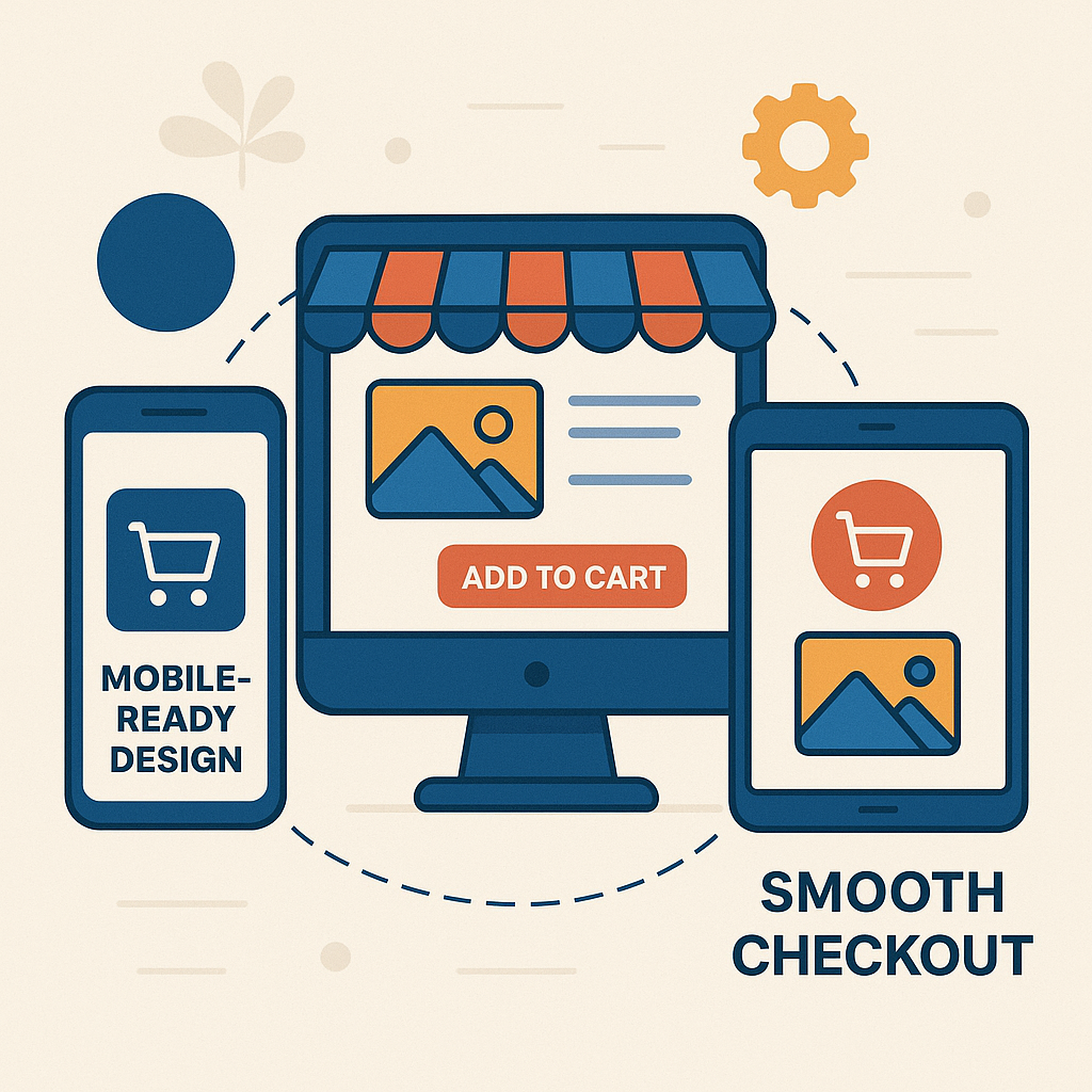
A customer's journey today is rarely limited to a single device. People often browse a product on their mobile during a commute, compare prices on a desktop at work, and finally complete the purchase on a tablet at home. Providing a consistent and fluid shopping experience across all devices has become essential for businesses aiming to improve conversion rates, customer satisfaction, and brand loyalty.
This post explores actionable strategies and best practices to ensure your online store delivers a smooth, unified experience across smartphones, tablets, laptops, and desktops.
1. Understand Cross-Device Behavior
Before optimizing, it's important to understand how users interact across different devices. Customers may:
- Start browsing on mobile and finish the purchase on desktop.
- Compare products between devices.
- Use mobile for quick research but prefer larger screens for final decisions.
- Expect saved carts, wishlists, and login sessions to transfer across devices.
2. Prioritize Responsive Web Design
A responsive website automatically adjusts its layout, images, fonts, and navigation to fit different screen sizes. Rather than creating separate mobile and desktop sites, a responsive design ensures consistency and efficiency.
Key elements for a responsive design:- Flexible grids: Use relative units like percentages instead of fixed pixels.
- Adaptive images: Serve smaller images to mobile users to improve load speed.
- Touch-friendly elements: Ensure buttons and links are large enough for mobile touch interactions.
- Breakpoints: Define CSS breakpoints for mobile, tablet, and desktop to adjust layouts appropriately.
Modern frameworks like Bootstrap and CSS techniques like Flexbox and Grid make responsive design implementation faster and cleaner.
"A seamless shopping experience across devices is no longer a luxury—it’s a necessity. Businesses that ensure consistency, speed, and personalization across mobile, tablet, and desktop will not only retain customers but also build lasting brand loyalty."
3. Mobile-First Optimization
Since mobile traffic often surpasses desktop traffic for many online stores, designing for mobile-first is no longer optional.
Critical mobile-first considerations:- Fast loading times: Optimize images, use lazy loading, and minimize heavy scripts.
- Simplified navigation: Implement hamburger menus, sticky navigation bars, and intuitive category structures.
- One-handed usability: Place important actions (like 'Add to Cart' and 'Buy Now') within thumb’s reach.
- Minimalist design: Prioritize essential elements and reduce clutter on smaller screens.
Google’s Core Web Vitals metrics also emphasize the importance of mobile usability for better search rankings.
4. Consistent User Interface (UI) and Branding
Maintaining consistency in colors, fonts, button styles, icons, and messaging across devices reinforces your brand identity and builds user trust.
SImportant aspects:- Uniform branding: Ensure logos, brand colors, and tone of voice remain the same everywhere.
- Identical product details: Product descriptions, pricing, and specifications should not differ between mobile and desktop views.
- Cart persistence: A customer adding an item on mobile should find it in their cart when they switch to desktop.
Inconsistent experiences can confuse users, create distrust, and lead to cart abandonment.
5. Enable Cross-Device Cart and Session Syncing
One of the biggest frustrations for users is losing their cart contents or browsing history when switching devices. Implement features that allow carts, wishlists, recently viewed products, and session states to sync automatically.
Best practices:- User accounts: Encourage customers to log in or create an account for personalized experiences.
- Guest session syncing: Use cookies and secure local storage methods to maintain session data without forcing login.
- Email reminders: Send cart recovery emails that work seamlessly across devices, allowing users to pick up where they left off.
Many eCommerce platforms like WooCommerce, Shopify, and Magento offer plugins and APIs to handle cart persistence across devices.
6. Optimize Checkout Experience for All Screens
The checkout flow must be fast, intuitive, and frictionless, regardless of the device.
Checkout optimization tips:- Auto-fill fields: Enable auto-complete for addresses and card details.
- Minimal steps: Limit checkout to as few steps as possible (preferably single-page checkout).
- Guest checkout: Allow customers to purchase without creating an account.
- Mobile-friendly payment options: Offer Apple Pay, Google Pay, and digital wallets in addition to card payments.
- Error handling: Clearly highlight input errors and suggest corrections in real-time.
A tedious checkout on mobile often results in customers postponing or abandoning their purchase.
7. Personalization Across Devices
Delivering personalized recommendations, dynamic pricing offers, and content based on user behavior can significantly improve engagement and conversions.
Personalization examples:- Product recommendations: Show products based on past browsing or purchase history.
- Targeted promotions: Offer device-specific deals, such as mobile-only discounts.
- Location-based suggestions: Suggest stores or pickup points based on the user’s location.
With the help of CRM tools, AI-based engines, and marketing automation, businesses can create consistent, relevant personalization across devices.
8. Focus on Performance and Speed
Page speed directly impacts user satisfaction, SEO, and conversion rates. Optimizing for speed across all devices should be a continuous process.
Speed optimization tips:- Use a Content Delivery Network (CDN): Distribute your content globally to minimize latency.
- Compress images and files: Tools like TinyPNG, ShortPixel, or built-in CMS plugins help reduce file sizes.
- Minify code: Remove unnecessary spaces, comments, and redundant code from CSS, JavaScript, and HTML.
- Implement caching: Browser and server-side caching dramatically improve load times.
- Avoid intrusive pop-ups: Particularly on mobile, pop-ups can disrupt user experience and hurt SEO.
Google PageSpeed Insights can help identify performance bottlenecks for each device type.
9. Seamless Omnichannel Integration
If your business operates both online and offline, a true seamless experience must bridge the digital and physical worlds.
Ideas for omnichannel integration:- Click and Collect: Allow users to buy online and pick up from a physical location.
- Unified inventory management: Ensure product availability and prices are synchronized across all channels.
- Cross-channel promotions: Enable customers to redeem online coupons at physical stores and vice-versa.
- Customer support access: Offer easy access to chat, email, or call support across devices and platforms.
Delivering omnichannel flexibility encourages customers to interact with your brand in ways most convenient to them.
10. Regular Testing and Optimization
No shopping experience can be perfected without regular testing. Devices, browsers, and user expectations evolve continuously, requiring businesses to adapt.
Testing checklist:- Device testing: Test your store on a wide range of smartphones, tablets, and desktops.
- Browser compatibility: Check compatibility across Chrome, Safari, Firefox, Edge, and Opera.
- A/B testing: Experiment with different layouts, CTA placements, and checkout flows.
- Heatmaps and session recordings: Tools like Hotjar or Crazy Egg show where users click, scroll, and drop off.
Regular updates based on real user feedback and analytics ensure your store remains smooth, intuitive, and delightful across all devices.
Conclusion
Delivering a seamless shopping experience across devices is no longer a competitive advantage — it's a necessity. Customers expect effortless transitions between mobile, tablet, and desktop without friction. By focusing on responsive design, mobile-first strategies, consistent branding, cart syncing, personalized journeys, speed, and continuous optimization, businesses can meet customer expectations and foster long-term loyalty.
Investing in cross-device shopping experiences not only improves conversion rates but also strengthens brand perception in an increasingly connected world.
Comments (6)
Lucas Müller | May 10, 2025
This article nails it! Understanding how users switch between mobile, tablet, and desktop—and ensuring consistent cart persistence—has boosted our conversion rates significantly. Responsive design plus saved carts works wonders!
Priya Shah | May 25, 2025
Helpful guide! Emphasizing mobile-first optimization and thumb-friendly UI design really resonated. I’ve updated our store layout accordingly—really reduced cart abandonment.
Sofia Ramirez | Jun 08, 2025
Great points on personalization across devices. Showing recent viewed products or mobile-only promotions across screens helps keep engagement high. Seamless user experience = better retention.
Ankit Joshi | Jun 30, 2025
Very practical advice on cross-device session syncing—especially guest sessions and email cart recovery. Implementing this has already helped recover lost carts and increase sales!
Emily Thompson | July 15, 2025
Love the focus on performance—using CDN, compressing images, and testing across multiple devices. Our page load times dropped drastically, and users stay engaged longer.
Swati Kapoor | Aug 22, 2025
Great reminder about consistent UI and branding across devices. Ensuring fonts, buttons, and product messaging stayed the same on all screens has built user trust and reduced confusion.
Leave a Comment